Showing posts with label upandadam. Show all posts

Tuesday, 20 October 2015

Andrew Beck: Before the Afterimage

by Ashleigh Hutchinson

CAUTION: AFTER IMAGE MAY CAUSE CONFUSION, WONDERMENT, AND A GENERAL QUESTIONING OF THE REALITY OF THE WORLD AROUND YOU. 
Andrew Beck is an Auckland based artist who has exhibited his work in New Zealand as well as Tokyo, Melbourne and Berlin. What began as a study of photography at Massey University of Wellington transformed into an exploration of the creation of photographs without a camera. This may sound like a fool’s errand, but photography has its roots in the method. Early developments in photography by scientist Anna Atkins for example, with the Cyanotype (fig.1) or more famously Lace (fig. 2) by William Henry Fox Talbot, saw the use of photosensitive paper that reacted with light when exposed. Read Lucy Jackson’s Adam Art Gallery Seminar Series: ‘In Absentia: The Politics of Cameraless Photography’ by Geoffrey Batchen for a more detailed discussion about the medium. What Beck has done is utilised this technique in his rhetoric about the use of space and its interaction with light. His installation in the Adam Art Gallery entitled After Image is part of a larger exhibition The Specious Present, which consists of four artists whose work visually articulates William James concept of the ‘specious present’. It denotes a period of time that is longer than the present moment but that exists between the past and the future.
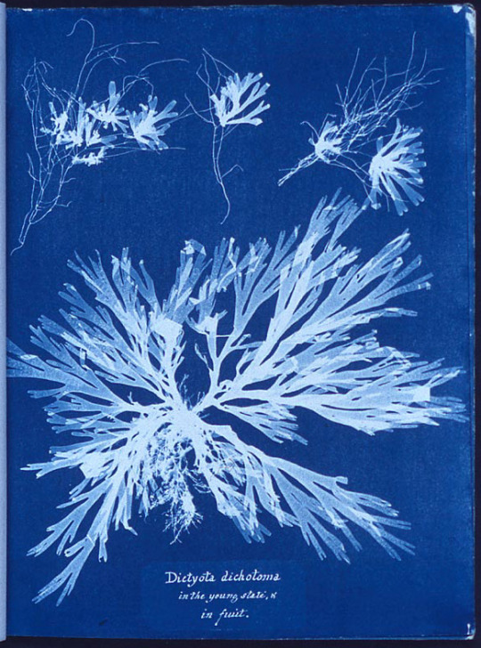


Fig. 1
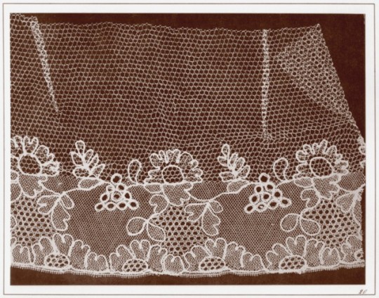


Fig. 2
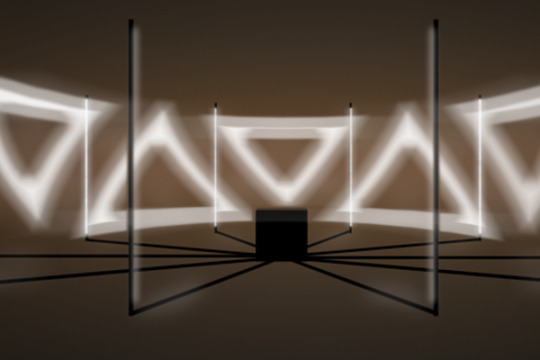
When I first saw Beck’s pieces at the exhibition, I was immediately enthralled, intrigued, and a little more than confused.  He had created objects of indeterminate origin, undetectable technique and interesting form. To quote the Greek philosopher Socrates – ‘I am wise because I know one thing, that I know nothing’. I was flummoxed. What was obvious however was that Beck was playing off the light and space of the gallery itself. An innate understanding that your experience of a piece such as Linear Split (8 phases) (fig. 3), depended on your understanding of light and corresponding shadows and the way these were cast within the gallery space was obvious. Beck achieves through his work a sense of spatial awareness both in the viewer but also of the objects themselves. Shadow Strips Cascade (fig. 4) for example is a site specific piece that relies on the strip of light contributed by the architecture of the gallery itself, each photogram is made to look like a reaction to the piece directly before it. To create these Beck would place a piece of paper overtop of another light sensitive piece and with exposure to light would cause the white silhouette to remain. This to me is the epitome of the ‘specious present’ by which the cascade represents a continuous reaction to the light of the gallery space that means the artwork remains in a constant state of stasis.
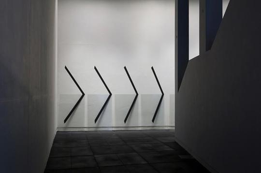


Fig. 3
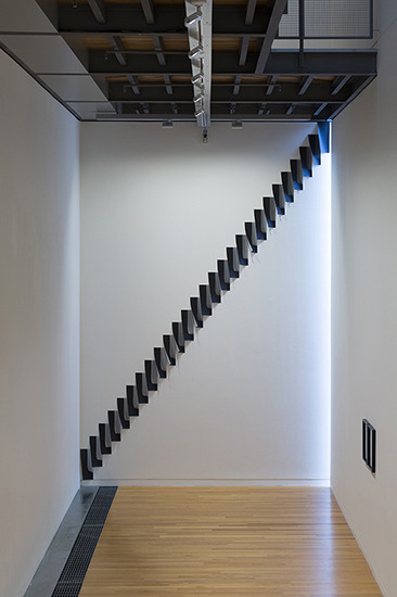


Fig. 4
Beck’s artwork itself exists in an in-between, and is a play on the duality of being, in that it becomes both photograph and painting, object and shadow, natural and manmade. As I stood in front of his work Linear Split (8 phases) my friend pointed out to me that she couldn’t decide whether the shadows projected by the glass were painted on or were in fact real shadows cast by the installation. We proceeded to spend a further ten minutes inspecting the shadows and still coming to no conclusion. Beck’s body of work intentionally plays on the exhibition space itself, causing you to question the validity of the term ‘unusable space’, what is gallery and what is installation, what is real and what is manufactured. An exhibition of Beck’s at the Galerie Luis Campaña utilised paint to create Invariant Shadow (fig. 5) which saw an abstraction of the idea of the realistic shadows that have previously plagued his work, to develop into a question surrounding the credibility of the work itself. The space, previously written-off as unusable in a gallery context, is transformed into a work of art through manipulation of our understanding of light sources, cast shadows and gallery space.


Fig. 5
Some of Beck’s earlier works betray the scientific facet of the medium’s ancestry. 11.35-11.55am (light drawing) (fig. 6), required knowledge of light patterns in situ at the Hamish McKay Gallery in Wellington. The abstract sundial (fig. 7) in the open window at the Govett-Brewster in New Plymouth was also time and light reliant, and echoes the use of the cyanotype by Atkins for documentary purposes rather than artistic. This piece represents a specific time of day that Beck has transformed into a continuous moment, the shadow of which is painted in black as cast by a metal rod. The metal rod embodies the ubiquitous nature of objects, by which the rod is industrial but has now been transformed into ornamental. These earlier works stand to show the development of Beck’s work from studying sources of light in relation to time, to involving space and creating philosophical, abstract objects of modernity.
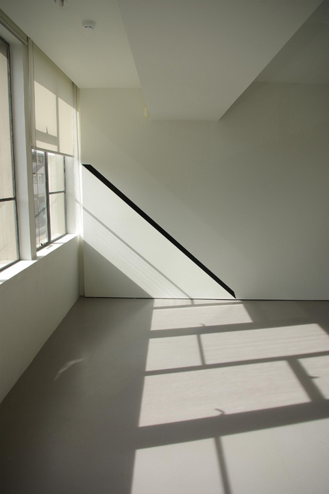


Fig. 6
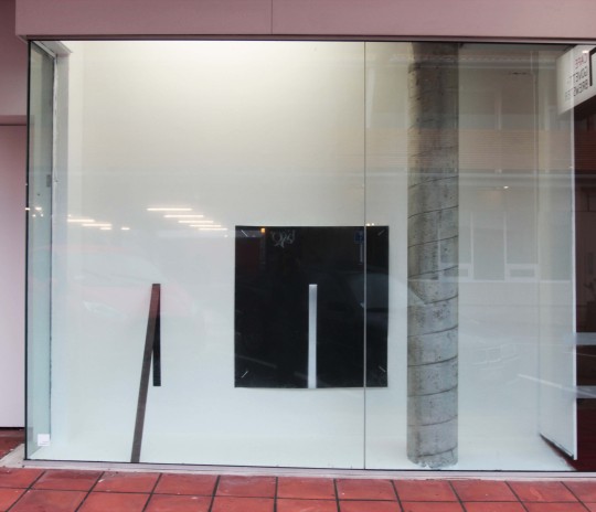


Fig. 7

When filtered through the medium of photography again, Beck’s images transform to inhibit another dimension. A dimension that is becoming more prevalent in a world of technology and social media, and the availability of that technology which encourages the institution of the snapshot photograph. The reflective surfaces of such intriguing photograms invite the viewer to use their own cameras to capture an image of the pieces such as Descending Platforms (fig. 8). The resulting photograph involves the viewer, who has thus been transformed into the object, as a representation of themselves is merged with the image of Beck’s. The viewer now also occupies the space of the image, meaning that in a way the viewer has come full circle in not just observing visual representations of the specious present, but becoming a part of it. 

Fig. 8


Wednesday, 16 September 2015

Walk

by Eleanor Lee-Duncan

If you haven’t yet seen this work, head into the Adam Art Gallery before this exhibition finishes (this Sunday the 20th!) to check it out.


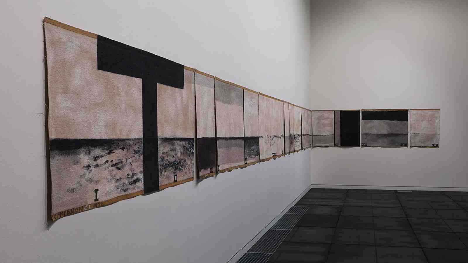
Colin McCahon, Walk (Series C) 1973, synthetic polymer paint on unstretched jute canvas, 11 panels. Collection of Museum of New Zealand Te Papa Tongarewa (photo: Shaun Waugh)

Walk (Series C), painted in 1973 is a monumental work by Colin McCahon, and seldom seen, since its purchase in recent years from a private collection by Te Papa, who graciously have loaned it to the Adam. Monochromatric, and disarming in size, it is neatly divided into 11 pieces, almost all linked by a single flowing horizon line of the sea. Hung at eye level, it keeps pace with me as I pause on each panel to contemplate. Am I keeping in step with Colin McCahon as he walked alongside this work mindfully, after each panel was complete? Did his eyes drift, slow, and then come to a still to inspect the same minute, scuffings of brush marks, and canvas threads unwinding on the edges? My eyes glide along the morse-code short and long dashes of the horizon line. 

We can view this painting as consisting of four layers of journeys or walks, which have been conceptually layered and co-exist.
The first: When we view this work, we, the viewer are compelled to walk from end to end of it in order to examine the whole work. This walk is our own journey of experiencing the painting, and keeps pace with our mental or emotional experience of the work.

The second: In doing so, we fall into step with McCahon’s own physical journey along Muriwai beach –  although in different temporal and spatial boundaries – open to the different sensory and emotive experiences of the wind, the sand, the water, the saliferous smell of the sea. After his friend James K. Baxter’s death in 1972, McCahon painted this work as an homage to the poet, perhaps thinking of him as he walked along the beach. Here, he has recorded the seascape, with the water and sky divided by a continuous thin line. McCahon reproduces this experience in his painting, walking alongside the strips of canvas while dabbing and dashing different dividing lines of land, sea, sky. Captured in different possible weather conditions, some are misty, hazy views while some are sharp, and clearly delineated.


image: www.mccahon.co.nz

The third: The walk of Christ to his execution, and the moments leading up to, and following his death. The canvas is marked with the Roman numerals 1-14, signifying the 14 Christian ‘Stations of the Cross’ – a reflective journey some people undertake around Easter, following different art works in physical spaces, or symbolic or literary anchor points in order to contemplate each experience that Jesus may have gone through. For example, the first panel has the numerals ‘I’ and ‘II’ inscribed, divided by a thick black ‘T’ of a cross. These two stations are traditionally held to be Jesus sentenced to death by crucifixion, and Jesus picking up the cross to carry it up the hill to his death. Here, the ‘T’ cross marks both the imminent method of execution, and the physical strain of the beginning of Jesus’ walk, carrying the physical weight of the instrument of his death. The only other thick black vertical section McCahon has painted is number 11, Jesus being nailed to the cross. This heavy, driving downward line brings to mind the exertion of nails being driven through Christ’s flesh to affix him to the wood. It is followed by three stacked sections of thicker grey paint, the top section black, for the panel representing the 12th and 13th stations: Jesus’ death and deposition from the cross. ‘Reading’ this panel, our eye drags downward on this canvas from the darkest stripe at the top, effectively mirroring the downward pulling of Jesus’ body from the cross.
The fourth: The spiritual journey to the afterlife of deceased Māori souls, up the West coast of Aotearoa New Zealand, past Muriwai beach and onto the sacred site of Cape Reinga, where they depart from the ancient pohutukawa tree. There, they travel down the overhanging roots of the tree, into the ocean. The spirit would surface briefly at Manawatawai (Three Kings Island) to take a final look at the landscape, occupied by the living, before continuing on to the next world. McCahon’s end panel, painted white, has a faint tracing of a line in the sky, floating parallel to the sea – perhaps a spirit taking its last journey.

Friday, 28 August 2015

Check out Lux before it’s over!

Hey everyone, if you haven’t already, be sure to check out the Lux Light Festival in Wellington this weekend (tomorrow is the last night it will be on!).
You can find the map to the various art works in light smattered through central Wellington here, at the webpage:
http://lux.org.nz/

The Circular Ruins by Jorge Lus Borges

Tuesday, 25 August 2015

Ihaia Puketapu

By Bhavana Bhim & Ella Steele

Ihaia Puketapu, a Wellington based wood carver and former Victoria University student gives us a glimpse into his artistic life and involvement within the community. His inherited carving skills are used to promote knowledge and development to youth groups in the Wellington region. Ihaia is currently working with BGI, the Wellington Boys’ and Girls’ Institute. Through teaching wood carving courses, he encourages youths to work together and learn necessary life skills to grow and become successful leaders. Ihaia’s collaboration with BGI offers us insight into the effect contemporary New Zealand art is having on today’s society.


Puketapu was born in Wellington and grew up in Waiwhetu.  He has a BA from Victoria University, specialising in Maori, Commerce, and Resource Management. After university he started working with young adults from CYF’s houses. His now retired uncle “Rangi Hete” was a master carver and taught Puketapu at his carving school in Waiwhetu.

Puketapu further developed his skills in his last year at Victoria University. He had gaps in his timetable which he used to take up his Uncle’s carving course. He looks up to his Uncle and thinks of him as a very successful artist. Ross Davis, one of the members from BGI (Boys and Girls Institute), approached Puketapu’s Marae looking for a carver to help them build a sculpture for their building project. Puketapu started working part time for BGI shortly after his artistic talent was recognised.
 BGI was founded in 1883 by a group of people linked to St John’s Church in Wellington. The church was looking for an organization that would benefit the younger community. Puketapu collaborated with them by running workshops for young people in woodcarving. Puketapu and his students helped carve the “Poutokomanawa,” (or Pou) which is a traditional pole at the centre of a Marae. Soon after this Puketapu was offered a full time job for a year working on the Poutokomanawa for BGI. They wanted a carving which drew on traditional Maori motifs and combined them with non-traditional motifs in order to represent BGI's history.
According to Puketapu, the carving is “a work in progress.”

instead of the carving being traditional with Maori images it’s contemporary.”

The collaboration with BGI is a yearlong project. So far the carving depicts figures of importance to the history of BGI with images of mayors such as Sir George Troup and John Aitkin who contributed to the institute.
 One of the challenges that Puketapu faced with this sculpture was depicting western images and motifs. The designs on the wood show stylised figures with objects such as stop watches.

Traditionally, the Maori rule of thumb in carving the proportions of the body is that the head, torso and legs each take up a 3rd of the figure. Puketapu had to play around with the depiction of western figures and objects to make the proportions realistic. In this situation, the artist stated,


 “The depiction of non-Maori objects are ‘semi-realistic, semi-abstract’, it’s a fusion.”

Puketapu mentioned that carving the Maori figures was easier, as there is a system of cuts made in the wood to project certain symbols, and he was trained in how to create shapes of figures in the traditional way.  However, according to Puketapu, there’s “much more thought” going into the other figures as they are more realistic in depiction. Puketapu combined Maori and Pakeha motifs onto the wood. There is a Celtic Presbyterian pattern which symbolises BGI’s connection to St John’s church, while the background on the side has interloping crescents called “Matakupenga” which signifies ‘interconnectedness.’ At the moment as the work is in progress, Puketapu is deciding on how he will finish the carving with his youth group.


 Apart from his community projects, Puketapu spoke about his interests in the arts. He is inspired by other carvers who turn their lives around, for instance, his uncle Hete who established the carving school to teach others. This inspires Puketapu to help young adults in the community. He is also inspired by the “big names” such as Dali and Da Vinci.
Puketapu pointed out that the carving market in New Zealand is changing and adapting. Before his uncle arrived, there were hardly any carvers at his Marae, but now there are many. There was not much work for carvers initially as it was a bartering system where they had to work for food rather than money. It is an expensive task to carry out traditional carving as there is a shortage of native timber which is very expensive today. Timber availability is an obstacle for carvers who struggle to obtain the correct materials. Apart from timber, the ability to carve with flat basic greenstone chisels that Puketapu’s ancestors used has changed. This is because for the last 150 years Maori adapted to metal tools which European settlers introduced.  Many carvers today are moving into traditional Maori tattooing. Puketapu pointed out that kiwis, who have no Maori ancestry are getting tattoos as part of a shared bi- cultural New Zealand identity and heritage.  Puketapu thinks this is “pretty cool”.


For more information on Puketapu and BGI visit the website: http://www.bgi.org.nz/BGI/Home.html

All quotes by Ihaia Puketapu, interview conducted by Bhavana Bhim and Ella Steele on Friday the 10th of July 2015, Wellington NZ.

Saturday, 8 August 2015

Word of the Week: Taonga

by Eleanor Lee-Duncan Taonga “tah-oh-nga” ‘(Māori). 1. (noun) property, goods, possessions, effects. 2. (noun) treasure, anything prized - applied to anything considered to be of value including socially or culturally valuable objects, resources, phenomenon, ideas and techniques. ’ -Te Aka Māori-English, English-Māori Dictionary and Index The Māori term does not easily correspond with any single English word, since it encompasses broader concepts than our words such as ‘treasure’ describe. Emphasis is placed on the spiritual dimensions, or wairoa of any given item, alongside or instead of its material worth as an object. Furthermore, while abstract concepts, or experiences can be described in English as ‘treasured’, for example, ‘I treasured hearing that poem’, in Te Reo Māori an experience such as this can be described in itself as taonga. Stories, ideas, land features, people, found objects, works of art, or anything which one considers precious can be described as taonga. Furthermore, museums are referred to in Te Reo Māori as whare taonga (house of treasures).


Installation view, Fiona Pardington: In My Dreaming I Saw - MOEA IHO NEI I AU, 2015, {Suite}, Wellington
We can consider this word alongside the works of photographer Fiona Pardington, in her images of heitiki. A selection of her works at the exhibition ‘In My Dreaming I Saw – MOE IHO NEI I AU’, are currently on display at {Suite} gallery, 241 Cuba Street. Each work is a toned silver bromide fibre based print, depicting various heitiki, and one hei matau. Heitiki are carved Māori pendants, generally based on the human figure, and hei matau are fishing hook shaped pendants. These heitiki can be carved from wood, bone, or pounamu (greenstone). Heitiki are taonga not just because of the precious material value, particularly of pounamu, but also the spiritual or metaphysical aspect of them, as well as the personal, familial, or tribal history of the item.

Fiona Pardington, Taranaki Style with Paua Eyes Heitiki From The Burnett Collection Whanganui Museum, 2008, Toned silver bromide fibre based print, 600 x 500 mm, Edition 3/5
In these works by Fiona Pardington, we are presented with taonga, some carved from prized pounamu, one from human bone, several from fake bone. Rather than recording these objects, these taonga, in an objective documentary style of photography, Pardington shows them suffused with soft light, which makes the pounamu seem to glow with an aura. The photos are incredibly close up, so each taonga fills up almost the whole frame, and appears confrontingly large. Each minor scratch and blemish is highlighted; As Zara Stanhope says, ‘the tiki carry the scars of the individuals and families who owned and wore them.’
Fiona Pardington, Hei Matau, New Zealand, provenance unknown, Okains Bay Maori and Colonial Museum, 2002, Toned silver bromide fibre based print, 600 x 500 mm, Edition 1/5
Zara Stanhope continues an analysis of these taonga as photographed by Pardington by examining the ways they operate as a ‘critique of western destruction of indigenous cultures through the acts of settlement and assimilation, and the stripping of taonga from land and body.’ These photos appear to us in an incredibly intimate way, which opens up imaginative meditation and conjecture on who has possibly worn these heitiki, to where, and what the wearer experienced. While taonga and heitiki, as concepts, and individual objects, belong to Māori culture, since colonisation they have been collected, appropriated by, and made for, non- Māori peoples.
Fiona Pardington, Traditional Heitiki 1953.4.2.4 From The Burnett Collection Whanganui Museum, 2008, Toned silver bromide fibre based print, 600 x 500 mm, Edition 2/5
Further reading: Zara Stanlope, Slow Release: recent photography from New Zealand, 2002, Victoria: Heide Museum of Modern Art.


Monday, 3 August 2015

Exposing Adolescence: Lola Graham-Wiggins’ works in the exhibition ‘Who are we?’


by Eleanor Lee-Duncan

Although ‘high’ art has an important place in our culture, other art work by people within our community also deserves to be examined, as it plays an important function in our society regardless of the artist’s age or experience. By doing this, we are able to have a more diverse, complex, and authentic view of what constitutes contemporary art within Wellington. One recent exhibition based on this concept of the importance of art, regardless of the age of an artist, was ‘Who are we?’ which featured six teenage photographers exploring their own perceptions and perspectives on what it means to be a teenager in Aotearoa New Zealand. This was situated at PhotoSpace gallery, upstairs on level 1, 37 Courtney Place, which is the only art gallery in Wellington exclusively dedicated to contemporary and international photography. The exhibition was held by Zeal Youth Education Trust, for students who had just completed their photography course.  Zeal is a not-for-profit youth organization with centres based in Wellington, Hamilton, and West Auckland, which aims to see teenagers reach their full potential through expressing their creativity within their community. These photography courses are part of a series of workshops which intend to engage teenagers in affordable, creative, practical learning.


Installation view of Lola Graham-Wiggins' works in PhotoSpace, photo by Lehi Lee-Duncan

Among the six artists was Lola Graham-Wiggins, a 17 year old from Wellington High School. Graham-Wiggins’ sharp eye for balanced compositions and layered juxtapositions of textures, especially contrasting the human body against nature, made for a distinctly coherent and compelling series. Through the photography course, Graham-Wiggins was provided with photography tutors, and a Canon EOS 1000D camera to borrow for the duration of the course, and the opportunity to exhibit her art work.  


Lola Graham Wiggins, 'The calm before the storm: A rather cliché saying that can often ring true', photographic print on paper. 


Some of her art work features the teenage body, uncovered, as part of an exploration of identity and self-awareness, within the tension of the transition between childhood and adulthood. In fact, the not-for-profit organization had to delicately manoeuvre a way to safely and conscientiously exhibit her work in the gallery: although supportive and encouraging of the young artist, they were well aware of the problematic aspect of exhibiting artwork depicting nude under 18s. Initially Zeal staff members considered selecting other art works of Graham-Wiggins to show in this exhibition. However after recognizing how important these works were to her, staff members decided to prioritise the inclusion of these works, and ensured that this was done in a protected and delicate manner, promoting safety and inclusivity from all involved parties. After narrowly avoiding the exclusion of these potentially contentious photos from the exhibition, the solution that both Lola Graham-Wiggins and Zeal came to was to put up a disclaimer on the exhibition wall, and to use signed consent forms which the under 18 year old models and their parents signed. Graham-Wiggins said that the staff and managers of Zeal ‘worked together to find out a way to support me so I could get my voice to be heard.’ 


Lola Graham-Wiggins, 'Stress: Are you drowning, or is there just a lot to do?', photographic print on paper.


Graham-Wiggin’s portrayal of the human body was deliberately evocative – she describes her attitude to anatomy as ‘It’s a body, get over it!’ – but she is also interested in ‘symbolizing vulnerability’ through the nudity and turned backs of her models, to explore the experience of being a teenager. ‘This is me expressing myself how I deem appropriate,’ Graham-Wiggins tells me. When I asked how it felt having her artwork on display in an exhibition, Graham-Wiggins answered ‘Terrifying! I am terrified right now. I took a reasonably personal approach to [the photos], and from the start I was a bit iffy about whether this is too much of a serious theme for me to be going with. . . But it was the only one that seemed to capture who I am.’


Lola Graham-Wiggins, ‘Hopelessness: Lower your white flag’, photographic print on paper.
Brook Turner, the CEO of Zeal Education Trust was particularly fascinated by Lola’s work ‘Confusion: Conformity vs Individuality’, which depicts two teenagers with their faces blurred by shaking, against the background of a tree:
‘When I look at this photo I just see an absolute bombardment of messages, expectations, and statements of identity that are hitting young people, and their response is just being in a state of flux, and uncertainty, and sort of shifting between “What is truth?”, “Where is home?”, “Who is helpful here?”, “What is helpful?”, and “Where should I focus?”, “Who am I?” But then this incredible backdrop of a huge strong tree that speaks of this primal stability and life, and nature, and the cycle of life that always has rhythm and has strength . . . and this beautiful contrast that shows both the troubling issues of our time, and yet the hopeful message that is in our world that if we just open our eyes and see it, we’ll find peace and hope.’


Lola Graham-Wiggins, 'Confusion: Conformity vs. Individuality', photographic print on paper.

Quotes from Lola Graham-Wiggins and Brook Turner are from interviews with the writer, conducted at the exhibition opening on 1 July 2015.
Full disclosure: the writer’s husband works as the Photography Course Coordinator for Zeal. Although trying to stay clear of bias, her support and passion for seeing teenagers express themselves will doubtless have influenced this writing. The models in these works have given permission for the photos to be reproduced here.


Friday, 24 July 2015

Word of the week

Art vocab to impress your friends

by Eleanor Lee-Duncan

Chiaroscuro “key-are-oh-skur-oh”

‘(Ital. light-dark). As generally used, chiaroscuro (or the French clair-obscur) means the balance of light and shadow in a picture, and the skill shown by the painter in the management of shadows.’
                                        -The Penguin Dictionary of Art and Artists
In other words, when we look at an image, whether a painting, photograph, film still, drawing, or engraving and can clearly see an interplay between areas of light and darkness, we are looking at chiaroscuro. This can be used as soft, smoky blended areas to create a sense of subtle three-dimensionality, or it can be used boldly in clear, crisp areas of light and shadow which contrast within an image to create a sense of dynamism or drama. Sometimes chiaroscuro is used to highlight or bring attention to a certain area or aspect of a work.
The current exhibition at the Adam Art Gallery, called The Specious Present, is fairly monochromatic: most artists limit themselves to shades of white and black in the works displayed.
Image credit: Adam Art Gallery 
For example, in this work by Colin McCahon, currently on display at the Adam Art Gallery, titled Walk (Series C), we can see that McCahon has used different gradients of painted shade in each strip of canvas. In the first panel on the left, McCahon has used chiaroscuro to create a jet black, vivid ‘T’ shaped cross, which cuts down through the entire composition with force. The ‘T’ stands out especially because the horizon line which intersects it is lighter as it gets closer on either side. Because of this, the lower half of the ‘T’ seems to stand out more – this is because the fading horizon line behind it emphasizes it, and seems to push the ‘T’ towards us.
Image credit: caravaggio.org


In a more traditional sense, chiaroscuro is used in art history to refer to this interplay between light and shadow especially in Baroque art, for example in Caravaggio’s paintings. Like his painting above, Judith beheading Holofernes, Caravaggio uses chiaroscuro as a strong compositional device. He has used bright, harsh light on the three figures which contrasts with dark areas, defining the muscular contortions of Holofernes as he dies. Judith in the centre seems to radiate with this light, which illuminates her face and collar. Also, you can see that the shadows in the background are incredibly dark, making the figures appear like spot lit actors frozen in a film noir scene.